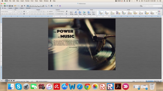
I started this project with some sketches that I thought would work well with my subject matter. I wanted something simple, and not overwhelming because meditation should be simple. I took my sketches and used InDesign to draw boxes to represent where I’d be adding text as well as images. I used a large image and put it in the background of page two. I haven’t been able to figure out a color I like for page one, and I’m trying to find a font that I like.


Fonts Used: Title (Bradley Hand), Text (Abadi MT Condensed)
Image Sources:
http://pre11.deviantart.net/55ea/th/pre/i/2011/145/c/8/sunrise_of_hope_by_flybyhacker-d3h6b7h.jpg
https://themorningbreaks.files.wordpress.com/2009/05/scriptures_0505102.jpg
http://www.ikspring.nu/wp-content/uploads/2015/11/bigstock-Zen-Balance-8292290_595-2.jpg


 Outdoor-Rework
 Outdoor-Original
 Indoor-Farther Out
 Indoor-Closer
 Foreground
 Background
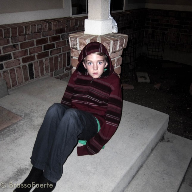 Rule of Thirds
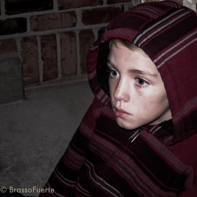 Lead Room


