8C Photography Activity

ChrisArmstrong-Outdoor-Rework-01Outdoor-ReworkChrisArmstrong-Outdoor-Orig-01Outdoor-OriginalChrisArmstrong-Indoor-01Indoor-Farther OutChrisArmstrong-Indoor-02Indoor-CloserChrisArmstrong-Foreground-01ForegroundChrisArmstrong-Background-01BackgroundChrisArmstrong-RuleOfThirds-01Rule of ThirdsChrisArmstrong-LeadRoom-01Lead Room

The photos I took were a challenge because I haven’t done anything with photography or editing before.  I have a decent point and shoot camera, a Canon PureShot S95 which has some additional features that helped to get the Background/Foreground part of the assignment done.  I chose to include the original photo of the sky to show the difference between them.  It was more for me to see how just changing a few things in Lightroom could make such a big impact on the end result.

The pictures with the coins and hammer are some tools a brother-in-law of mine has to make rings out of coins.  I felt like the dapping tools were interesting and wanted to showcase them.  I liked how the light reflected off of the top of each of them.  My 3 year old, Josh wanted me to take a picture of his Star Wars Galactic Heroes, so I had him help me set them up.  My last set are of my 11 year old son, Orion.  He was a good sport as his dad tried to figure out how to get enough light without making the flash on the camera something that detracted from the image.

I imported the images into Lightroom and began the process of cleaning up the photos, trying to get the red-eye tool to work like I wanted and ultimately change the photos to my liking.  I darkened some of the photos to remove the background and decided I wanted a bit of a more grainy, old school photo look for the photos with my son.

8A Social Media Marketing Project

Company: Younique by Sara

Objective: Launch a new campaign promoting the Younique product with #KISS.YOUNIQUE as the driving force behind it. KISS stands for Keep It Sensationally Simple, and is derived from the idea that makeup should be developed with simple, non-harmful ingredients.

Strategy: Create some new images with text that promote the campaign.

Process and Reasoning: I wanted to portray the clean and pure vision of the product line that my client (Sara) wanted. She wanted clean lines and images that reinforced the natural approach that Younique takes when developing their product line. I came up with #KISS.YOUNIQUE after I had gone through 8-10 design ideas that just weren’t working for me. The original idea of Keep It Sensationally Simple is a play on Keep It Simple Stupid. The audience is women that are looking for makeup that has ingredients that are clearly labeled and information that they can readily find. I’ve included 3 examples of what I made for Facebook, and also the cover picture I used. I created everything using Microsoft Word.

Critique: I wasn’t able to use the normal critique process and instead used my wife (Sara), and a friend that’s a graphic designer by profession. Sara had me change the Facebook profile picture 4 different times because they didn’t work well with the cover photo. That’s really when I came up with #KISS.YOUNIQUE. I had been striking out with getting an image she liked and finally pulled it off. My friend (Jay) gave me some advice on the text placement and helped me make designs that weren’t too busy. That was important since the message was to keep things simple.

Font: Lucida Sans/Sans Serif

Images Used: http://amazingwhitedress.blogspot.com/2016/01/white-dress-in-field.html

http://images.fineartamerica.com/images-medium-large-5/1-woman-blowing-kiss-ryan-jorgensen.jpg

http://www.youniquebyloriw.com/wp-content/uploads/2014/11/image.jpeg

http://usanationalmiss.com/wp-content/uploads/2013/01/younique-website-logo.jpg

http://www.simplystine.com/wp-content/uploads/2015/03/Dollarphotoclub_607214741.jpg

http://1844noaging.com/wp-content/uploads/2015/08/non-surgical.jpg

7A Magazine Content

The assignment for this week presented the challenge of writing a 2 page spread for either the New Era or Ensign magazines, which are magazines published by the Church of Jesus Christ of Latter Day saints.  I had a slow start trying to figure out where I wanted to go with this project.  I began pouring over the vast depths of my mind (it’s easy to get lost in there) and came up empty.  What came to me was the idea to incorporate part of my last project, combined with a church lesson I taught the first week of this month.  I started to search online to find doctrinal or Church messages about meditation.  I found what I was looking for and then found some images that had pictures of teens meditating, and another of scriptures.  I chose my audience as readers of the New Era.  My main thought process here was that I know it can be very overwhelming as a teenager to find outlets or ways to focus your energy and find the kind a way to center yourself.  I’ve included the article I came up with along with the images, and links to the images.

Story: Boost Your Connection

You sit down, open up your scriptures, and stare blankly at the pages. No matter how much you try and focus on the words, you’re distracted. Prayer has helped before but for some reason, today is different. There is a wall that’s very real and isn’t going away. I’m here to help you break through those moments where you feel stuck; when the world is so busy and distracting that you don’t have the connection to your Heavenly Father that you’d like to. I’m going to talk about something that is seldom discussed in the church; Meditation.

David O. McKay taught, “We pay too little attention to the value of meditation, a principle of devotion.” Wait a minute you feel yourself saying, isn’t meditation for people outside of the Church? Nobody has ever talked to me about meditating, so it must be something the Church doesn’t believe in. David O. McKay furthered the Churches views on meditation when he said, “Meditation is the language of the soul. It is defined as “a form of private devotion, or spiritual exercise, consisting in deep, continued reflection on some religious theme.” Would you believe that meditation is considered a form of prayer?

Meditation is a powerful tool that can help center your life, calm you when life feels overly complex, and help to establish the connection to your Father in Heaven that we all strive for. While meditation has its roots in Hinduism, Latter Day Saints can use the methods that have been adopted all over the world to find inner peace. If you were to look up the meaning of meditation, you’d find that it means a, ““variety of practices that includes techniques designed to promote relaxation, build internal energy, and develop compassion, love, patience, generosity, and forgiveness.” You might be surprised to discover that meditation also carries with it health benefits that will help you to live a longer, healthier life.

How can you go about trying meditation on your own to see if it helps you to strengthen the experiences with prayer, scriptures, and your Heavenly Father? I’m going to outline some very basic ways to start your journey into giving meditation a shot. It won’t require much of your time, and it could very well make the kind of changes in your day-to-day activities that really make a difference.

  • Find a quite place to sit or lie down
  • Close your eyes
  • Breath naturally, don’t try and control your breathing
  • Focus on how your body inhales and exhales. Focus on the breath itself, and slowly remove outside distractions. If you get distracted, focus on your breath and continue to focus your energy.

Try meditation for 10 minutes in the morning and 10 at night to start to see if you notice any changes when you go to pray or read your scriptures. The Lord wants us to establish the very best connection we can with him, meditation just might be the thing you’re missing in your daily meditations.

Favorite Sketch

IMG_1171

Images

Image Sources:

Girl Meditating In City

Search

Daily Stress

Meditation

Sun Through Trees


Slide Design Project

Speaker’s Outline

I’m interested in your potential for

• Happiness
• Productivity
• Energy
• creativity

Study of Positive Psychology
If we study what is merely average, we will remain merely average

Change
• Your view of the world
• Your lens
• Be better than average
• We’re bigger than our external world

Raise your level of positivity-Do the following for 21 days
Rewire your brain
• Write down 3 things that you’re grateful for
• Write down 3 NEW things each day
• Start a journal
• Exercise
• Meditate
• Start performing random acts of kindness

Summary

We need to change our world view and how we’re living in it.
Fill our lives with positive energy and learn to live a positive existence.

Process

I had a few talks that came to mind when I read that we were going to be making slides from talks we liked.
There was one TED talk in particular that stood out to me. It’s about Positivity. My audience is anyone
everyone that wants or needs to add splash of positive energy into their lives. It’s for anyone that
wants to make changes, but maybe doesn’t know where to start. It’s for those that want to see changes
take place that will not only change them for the better, but also change those people around them.
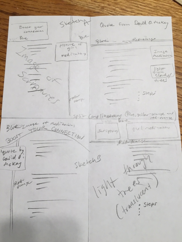
I went online and found two images that really popped for me. The girl dancing in the field, and the picture
of the girls reflection on the camera lens. I knew I didn’t want the pictures to be too busy, and wanted
to somehow narrow down the focus to show the image I wanted to be the star of the show. I had a couple sketches that I used that had too much going on.

I started thinking about the example design and how I could utilize some of the ideas that were there. I didn’t
want to copy it, but wanted to have a similar focal point. I drew two triangles on the paper at either end of the
page because I pictured in my head what a photographer does when they want to get the image cropped out.
They take their hands and box out the area that they’re most interested in. This is what was my driving force.
Once I got that figure out, I got really excited about the images I was going to choose and went through at least
5-6 different images for each slide until I found ones that had the look and feel that I was shooting for.  My color scheme was taken from the photos I found.


6A Drawing

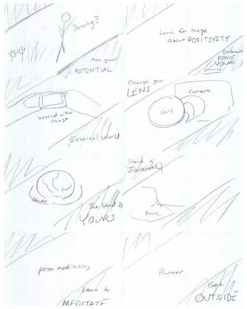
The drawing above is what I ultimately decided I wanted to work with.  I had one slide that I had the triangles going on opposite corners.

Originally it was because the picture felt off with the triangles the other way.  The Critique processed help me sort that out.

Critique Report

I got critiques from Alan Anderson, Kaylynn Harrison, and CaRynn Harris.  Alan suggested that I work on the transparency on the triangles

because with some of the coloring they were difficult to see, or didn’t seem right.  I went back and made some adjustments to them, and then

made that transparency uniform throughout the project.  It made it feel more uniform and helped the images stand out more.  CaRynn pointed

out that one of my images had the triangles going in a different direction.  I was aware of this and had rationalized it because I felt like it worked.

As I worked through the slide full-screen, I could see what CaRynn was getting at.  It was a definite break in the flow by having it there.

The feedback I got was very valuable because I was able to refine a few things that really were working against me, not for me.


Link to the talk: The happy secret to better work by Shawn Achor

Fonts: Traditional-Playfair and Georgia for text

Links to images: Girl Dancing In FieldPositivityWorld ViewWorld In Your HandsJournalMeditateJogger

EVENT FLIER

5AChrisArmstrong-page-001 (1)

5AWordProof

Process: My idea here was to put together an event that would help build community bonds, as well as help underprivileged kids get a bike.  My audience was the entire population of West Jordan, UT.  I worked using some of the design sketches I had and tried to find an image that captured some of the elements I was looking for.  The color scheme from the photo matched a complementary color scheme I found online at  Smashing Magazine.  
I wanted to incorporate some circles into the design because of the round flow of the bikes fenders and tires.
I brought the picture over to Word, and then started to work bringing in shapes and text boxes to compliment it.

Critique Process: One of my classmates, CaRynn Harris made a suggestion that ultimately helped me to remove a text bubble that was showing the $10 price for the event.  The more I thought about how to work in her suggestion, the more I began to realize that it was taking away from the flow of the design.
I utilized many of the suggestions Sister Esplin gave during her critique session.

Color Scheme: Complementary: Blue, Cream, Orange

Fonts: Title-Rockwell Extra Bold (Slab Serif) Body Copy-Rockwell (Slab Serif)

Link to image: HD Wallpapers